春节将至!过年啦,挂灯笼!自己博客也是自己的家,迎接春节节日气氛!代码这里也分享一下,有喜欢的朋友拿去用,将灯笼挂在自己的博客上,增加点过年的气氛。
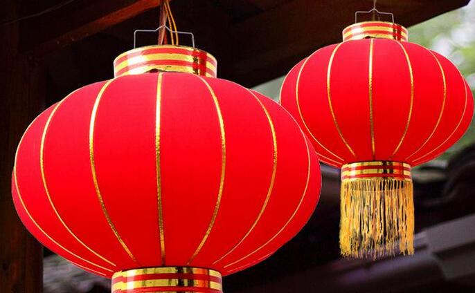
(单边红灯笼)下面有两边挂双侧灯笼教程

1.添加HTML代码将下面的HTML代码添加到主题页脚模板footer.php,标签的上面。
<!-- 灯笼1 -->
<div class="deng-box">
<div class="deng">
<div class="xian"></div>
<div class="deng-a">
<div class="deng-b"><div class="deng-t">节</div></div>
</div>
<div class="shui shui-a"><div class="shui-c"></div><div class="shui-b"></div></div>
</div>
</div>

<!-- 灯笼2 -->
<div class="deng-box1">
<div class="deng">
<div class="xian"></div>
<div class="deng-a">
<div class="deng-b"><div class="deng-t">春</div></div>
</div>
<div class="shui shui-a"><div class="shui-c"></div><div class="shui-b"></div></div>
</div>
</div>
2.添加样式
将样式代码添加到WP后台 → 外观 → 自定义 → 额外CSS 中,点击“发布”即可!
.deng-box {
position: fixed;
top: -40px;
right: -20px;
z-index: 999;
}

.deng-box1 {
position: fixed;
top: -30px;
right: 10px;
z-index: 999;
}

.deng-box1 .deng {
position: relative;
width: 120px;
height: 90px;
margin: 50px;
background: #d8000f;
background: rgba(216, 0, 15, 0.8);
border-radius: 50% 50%;
-webkit-transform-origin: 50% -100px;
-webkit-animation: swing 5s infinite ease-in-out;
box-shadow: -5px 5px 30px 4px rgba(252, 144, 61, 1);
}

.deng {
position: relative;
width: 120px;
height: 90px;
margin: 50px;
background: #d8000f;
background: rgba(216, 0, 15, 0.8);
border-radius: 50% 50%;
-webkit-transform-origin: 50% -100px;
-webkit-animation: swing 3s infinite ease-in-out;
box-shadow: -5px 5px 50px 4px rgba(250, 108, 0, 1);
}

.deng-a {
width: 100px;
height: 90px;
background: #d8000f;
background: rgba(216, 0, 15, 0.1);
margin: 12px 8px 8px 10px;
border-radius: 50% 50%;
border: 2px solid #dc8f03;
}

.deng-b {
width: 45px;
height: 90px;
background: #d8000f;
background: rgba(216, 0, 15, 0.1);
margin: -4px 8px 8px 26px;
border-radius: 50% 50%;
border: 2px solid #dc8f03;
}

.xian {
position: absolute;
top: -20px;
left: 60px;
width: 2px;
height: 20px;
background: #dc8f03;
}

.shui-a {
position: relative;
width: 5px;
height: 20px;
margin: -5px 0 0 59px;
-webkit-animation: swing 4s infinite ease-in-out;
-webkit-transform-origin: 50% -45px;
background: #ffa500;
border-radius: 0 0 5px 5px;
}

.shui-b {
position: absolute;
top: 14px;
left: -2px;
width: 10px;
height: 10px;
background: #dc8f03;
border-radius: 50%;
}

.shui-c {
position: absolute;
top: 18px;
left: -2px;
width: 10px;
height: 35px;
background: #ffa500;
border-radius: 0 0 0 5px;
}

.deng:before {
position: absolute;
top: -7px;
left: 29px;
height: 12px;
width: 60px;
content: " ";
display: block;
z-index: 999;
border-radius: 5px 5px 0 0;
border: solid 1px #dc8f03;
background: #ffa500;
background: linear-gradient(to right, #dc8f03, #ffa500, #dc8f03, #ffa500, #dc8f03);
}

.deng:after {
position: absolute;
bottom: -7px;
left: 10px;
height: 12px;
width: 60px;
content: " ";
display: block;
margin-left: 20px;
border-radius: 0 0 5px 5px;
border: solid 1px #dc8f03;
background: #ffa500;
background: linear-gradient(to right, #dc8f03, #ffa500, #dc8f03, #ffa500, #dc8f03);
}

.deng-t {
font-family: 华文行楷,Arial,Lucida Grande,Tahoma,sans-serif;
font-size: 3.2rem;
color: #dc8f03;
font-weight: bold;
line-height: 85px;
text-align: center;
}

.night .deng-t,
.night .deng-box,
.night .deng-box1 {
background: transparent !important;
}

@-moz-keyframes swing {
0% {
-moz-transform: rotate(-10deg)
}

50% {
-moz-transform: rotate(10deg)
}

100% {
-moz-transform: rotate(-10deg)
}
}

@-webkit-keyframes swing {
0% {
-webkit-transform: rotate(-10deg)
}

50% {
-webkit-transform: rotate(10deg)
}

100% {
-webkit-transform: rotate(-10deg)
}
}
如果只想在首页显示灯笼,可以用下面的判断语句把HTML代码包裹起来:
<?php if (is_home()) { ?>
<!-- 代码放这里 -->
<?php } ?>
给自己网站两边挂上双侧大红灯笼:

1.添加HTML代码
复制下面的代码到footer.php,同之前的,之前
<div class="deng-box">
<div class="deng">
<div class="xian"></div>
<div class="deng-a">
<div class="deng-b"><div class="deng-t">春节</div></div>
</div>
<div class="shui shui-a"><div class="shui-c"></div><div class="shui-b"></div></div>
</div>
</div>

<div class="deng-box1">
<div class="deng">
<div class="xian"></div>
<div class="deng-a">
<div class="deng-b"><div class="deng-t">快乐</div></div>
</div>
<div class="shui shui-a"><div class="shui-c"></div><div class="shui-b"></div></div>
</div>
</div>
2.将下面这个复制到style.css里面,WordPress可以这样:自定义——额外css,复制粘贴发布即可
.deng-box {
    position: fixed;
    top: -30px;
    left: 220px;
    z-index: 9999;
    pointer-events: none;
}

.deng-box1 {
    position: fixed;
    top: -30px;
    right: 222px;
    z-index: 9999;
    pointer-events: none;
}

.deng-box1 .deng {
    position: relative;
    width: 120px;
    height: 90px;
    margin: 50px;
    background: #d8000f;
    background: rgba(216, 0, 15, 0.8);
    border-radius: 50% 50%;
    -webkit-transform-origin: 50% -100px;
    -webkit-animation: swing 5s infinite ease-in-out;
    box-shadow: -5px 5px 30px 4px rgba(252, 144, 61, 1);
}

.deng {
    position: relative;
    width: 120px;
    height: 90px;
    margin: 50px;
    background: #d8000f;
    background: rgba(216, 0, 15, 0.8);
    border-radius: 50% 50%;
    -webkit-transform-origin: 50% -100px;
    -webkit-animation: swing 3s infinite ease-in-out;
    box-shadow: -5px 5px 50px 4px rgba(250, 108, 0, 1);
}

.deng-a {
    width: 100px;
    height: 90px;
    background: #d8000f;
    background: rgba(216, 0, 15, 0.1);
    margin: 12px 8px 8px 10px;
    border-radius: 50% 50%;
    border: 2px solid #dc8f03;
}

.deng-b {
    width: 45px;
    height: 90px;
    background: #d8000f;
    background: rgba(216, 0, 15, 0.1);
    margin: -2px 8px 8px 26px;
    border-radius: 50% 50%;
    border: 2px solid #dc8f03;
}

.xian {
    position: absolute;
    top: -20px;
    left: 60px;
    width: 2px;
    height: 20px;
    background: #dc8f03;
}

.shui-a {
    position: relative;
    width: 5px;
    height: 20px;
    margin: -5px 0 0 59px;
    -webkit-animation: swing 4s infinite ease-in-out;
    -webkit-transform-origin: 50% -45px;
    background: #ffa500;
    border-radius: 0 0 5px 5px;
}

.shui-b {
    position: absolute;
    top: 14px;
    left: -2px;
    width: 10px;
    height: 10px;
    background: #dc8f03;
    border-radius: 50%;
}

.shui-c {
    position: absolute;
    top: 18px;
    left: -2px;
    width: 10px;
    height: 35px;
    background: #ffa500;
    border-radius: 0 0 0 5px;
}

.deng:before {
    position: absolute;
    top: -7px;
    left: 29px;
    height: 12px;
    width: 60px;
    content: " ";
    display: block;
    z-index: 999;
    border-radius: 5px 5px 0 0;
    border: solid 1px #dc8f03;
    background: #ffa500;
    background: linear-gradient(to right, #dc8f03, #ffa500, #dc8f03, #ffa500, #dc8f03);
}

.deng:after {
    position: absolute;
    bottom: -7px;
    left: 10px;
    height: 12px;
    width: 60px;
    content: " ";
    display: block;
    margin-left: 20px;
    border-radius: 0 0 5px 5px;
    border: solid 1px #dc8f03;
    background: #ffa500;
    background: linear-gradient(to right, #dc8f03, #ffa500, #dc8f03, #ffa500, #dc8f03);
}

.deng-t {
    font-family: 华文行楷,Arial,Lucida Grande,Tahoma,sans-serif;
    font-size: 1.5rem;
    color: #ffa500;
    font-weight: bold;
    line-height: 42px;
    text-align: center;
    width: 25px;
    margin: 0 auto;

}

.night .deng-t,
.night .deng-box,
.night .deng-box1 {
    background: transparent !important;
}

@-moz-keyframes swing {
    0% {
        -moz-transform: rotate(-10deg)
    }

    50% {
        -moz-transform: rotate(10deg)
    }

    100% {
        -moz-transform: rotate(-10deg)
    }
}

@-webkit-keyframes swing {
    0% {
        -webkit-transform: rotate(-10deg)
    }

    50% {
        -webkit-transform: rotate(10deg)
    }

    100% {
        -webkit-transform: rotate(-10deg)
    }
}
不想在手机端显示,将这串代码复制加到上面CSS后面即可!
@media (max-width: 678px){.deng-box{display:none;}}
@media (max-width: 678px){.deng-box1{display:none;}}

